One thing we’ve been asked a number of times is how to add scroll animations to alert boxes to reveal them only as the user scrolls the page. The common use case being when the alert is fixed to the viewport and the element needs to show as the user scrolls to a particular point on the page.
The Issue with Scroll Animations
You may have noticed that the built-in scroll animations won’t work when applying it to the alert box directly. Actually, the scroll animations won’t work on any component that has been built with Oxygen’s Elements API. You will find this is also true for the Pro Menu component, the Shape Divider component and all the official Woocommerce components.
That said, it doesn’t mean we can’t still take advantage of the built in scroll library. The way around it is to simply wrap the alert box in a div. We can then position the div as fixed to the viewport, instead of the alert box and then apply the scroll animations to the container div instead of the alert box inside.
The important thing is to not add any styles to the div itself, only change the position to ‘fixed’, position it relative to the viewport with the top/left/right/bottom where you need it and add the scroll animation effect. The width, height and all other styles should be on the alert box itself.
Revealing at a Certain Scroll Position
As our new container div will be fixed to the viewport, we’ll need to make use of the ‘anchor’ setting in the scroll animations to control exactly when the element is revealed.
This anchor would be the section or element on the page that the user would scroll to in order for the div (and the alert) to become visible.
This is what the settings would look like on our div element if we wanted the alert inside to be made visible when the user scrolls down to a specific section that we have given the class ‘.alert-trigger’.
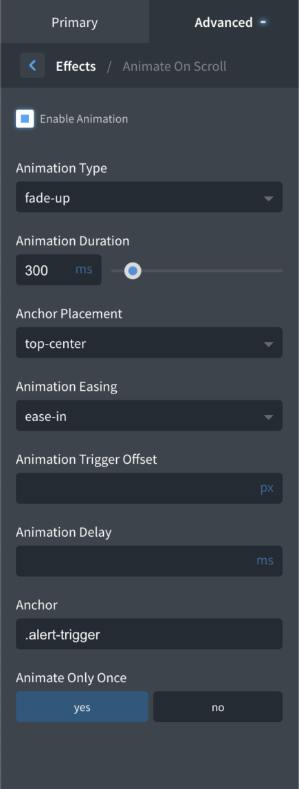
The anchor placement being set at ‘top-center’ means that the animation will be triggered when the ‘top’ of this section reaches the ‘center’ of the viewport. This can be changed to however you want it to be, you can also add an offset if you want more precise control over the number of pixels scrolled.
That’s it
Although not the ideal solution, hopefully Oxygen will add support for scroll animations on these new components soon, this is a fairly simple way to get the end result you need.
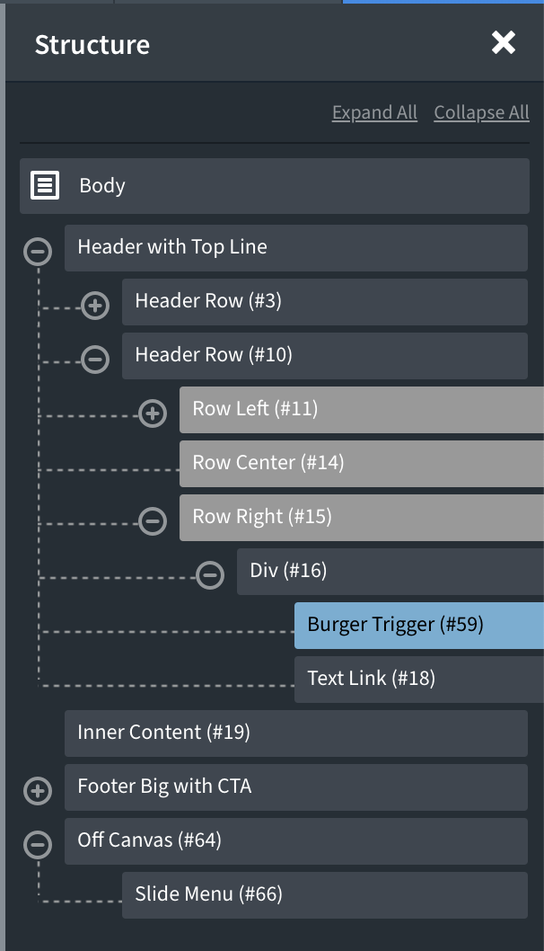
This article provides the steps to set up a fixed Burger Trigger near the top left corner of the browser and appearing on top of the Off Canvas component having a Slide Menu.
We shall make the hamburger menu static from 768px to 1300px since it will be overlapping the logo during these widths when using the Atomic design set of Oxygen. These widths can be changed depending on your site’s header layout.
Here is the sample structure after you have implemented the steps below.
Step 1
Edit your Main catch all template with Oxygen and add a Burger Trigger component. In this example, let’s add it to the left of text link in Header Builder’s Header Row (bottom one).
Set the Burger Line Height to 3 to make the hamburger’s lines thinner.
Go to Button Styles and set a padding of 10px each on top, left and bottom and 15px on the right.
Background Color: #ffffff
Border Radius: 30px
Go to Button Text and add MENU text. If you would like to change the font size of this text, you can do so at Typography.
Go to Advanced > Layout.
Set Position to fixed with 20px top and left each.
Set Z-index of 1001.
Step 2
Add an Off Canvas component below all the other components.
Under Layout / Spacing you might want to add a value like 100px so that there will be space for the X icon.
Add a Slide Menu inside the Off Canvas and select your desired menu to be shown.
In our example site, we added 10px padding at the top and bottom under Menu Items / Spacing.
Then under Sub Menus / Spacing, added 20px left padding.
Step 3
Let us add some custom CSS at Manage > Stylesheets.
.admin-bar #-burger-trigger-59-29 {
	top: 52px; /* 20 + 32 */
}

@media only screen and (max-width: 782px) {
	.admin-bar #-burger-trigger-59-29 {
		top: 66px; /* 20 + 46 */
	}
}

.hamburger-box {
	transform: scale(0.5);
}

@media only screen and (min-width: 768px) and (max-width: 1300px) {
	#-burger-trigger-59-29 {
		position: static;
	}
}
Replace all instances of -burger-trigger-59-29 in the above with the ID of your Burger Trigger.
.admin-bar #-burger-trigger-59-29 {
	top: 52px; /* 20 + 32 */
}

@media only screen and (max-width: 782px) {
	.admin-bar #-burger-trigger-59-29 {
		top: 66px; /* 20 + 46 */
	}
}
will ensure that the fixed hamburger menu will be 20px from the top even when admin bar is visible. 32px is the height of the admin bar above 783px. 782px and below it is 46px tall.
.hamburger-box {
	transform: scale(0.5);
}
will reduce the size of the hamburger menu lines.
@media only screen and (min-width: 768px) and (max-width: 1300px) {
	#-burger-trigger-59-29 {
		position: static;
	}
}
will make the hamburger menu static during the viewport widths when it will be overlapping the logo. You may need to change these widths or make any other adjustments as needed.
1:06mins
Easy to implement header search functionality with three types of header search.
4:45 mins
Showcasing two AJAX Woocommerce components. The mini cart and the cart counter. Both can be used together or with existing components like the Offcanvas and the Modal.
Vid – 6mins
A quick over the shoulder on visually styling a polling Fluent Form using the fluent form component in OxyExtras.